TECHNOLOGY
ES LINT
PRETTIER
Design Systems — Storybook with publishing to Chromatic and NPM


What is a Design System?
Imagine you’re building a house. You need a blueprint to guide the construction, right? Well, a design system is like a blueprint for creating consistent and cohesive designs across all aspects of a project. It’s a collection of reusable components, guidelines, and assets that ensure visual and functional consistency in your design work.
Why are Design Systems Important?
- Consistency: Design systems ensure that all elements in a project look and function in a uniform way, creating a seamless user experience.
- Efficiency: By reusing components and patterns, design systems streamline the design process, saving time and effort.
- Scalability: As projects grow, design systems help maintain consistency and coherence, making it easier to manage complexity.
- Collaboration: Design systems promote collaboration among team members, as everyone works from the same set of standards and guidelines.
Key Components of a Design System:
- Components: These are the building blocks of a design system. Examples include buttons, forms, navigation bars, and icons. Each component is designed and documented for easy reuse.
- Typography: Consistent typography ensures readability and visual harmony across all text elements.
- Color Palette: A defined color palette maintains brand consistency and aids in creating accessible designs.
- Spacing and Layout: Consistent spacing and layout guidelines help maintain visual balance and hierarchy.
- Guidelines and Documentation: Comprehensive guidelines and documentation explain how to use each component and adhere to design principles.
How to Create a Design System:
- Research and Analysis: Understand your users, brand identity, and project requirements before diving into design.
- Componentization: Identify reusable elements and create a library of components. We follow Atomic Design Methodology for this step.
- Establish Guidelines: Define rules and best practices for using components, typography, color, and layout.
- Documentation: Document each component’s usage, behavior, and variations to guide designers and developers.
- Iterate and Update: Design systems are living documents. Regularly update and refine components based on feedback and evolving needs.
Popular Design Systems:
- Material Design: Developed by Google, Material Design is a comprehensive design system focusing on visual consistency, motion, and interaction.
- IBM Design Language: IBM’s design system emphasizes inclusivity, accessibility, and enterprise-level scalability.
- Bootstrap: A front-end framework with a robust set of components and styles for building responsive web interfaces.
Creating a Design System with Storybook
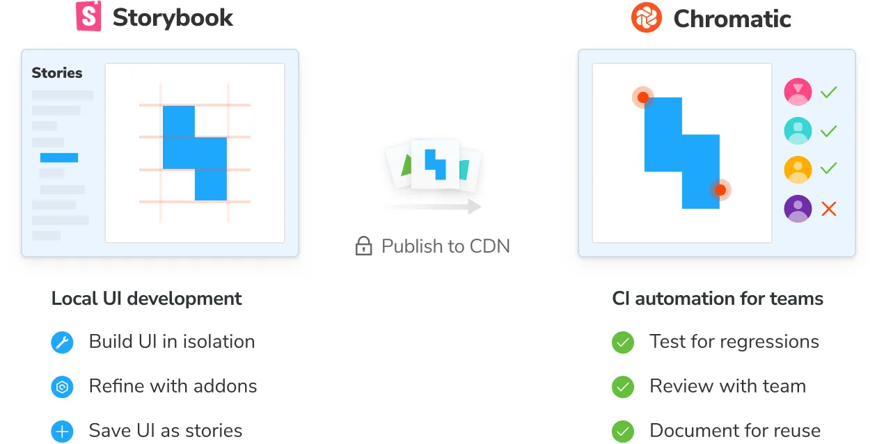
What is Storybook?
Storybook is an open-source tool for building UI components and documenting them in an interactive development environment. It allows developers and designers to create and test UI components in isolation, making it an excellent tool for building and maintaining design systems.
Storybook is a powerful tool for building and maintaining design systems by providing an interactive environment to develop, document, and showcase UI components. By following the steps outlined below, can create a robust design system that promotes consistency, efficiency, and collaboration in their projects.
Benefits of Using Storybook for Design Systems:
- Component Isolation: Test and showcase components in isolation, making it easier to identify and fix issues.
- Interactive Development: Experiment with different component states and variations in real time.
- Documentation: Automatically generate documentation from your stories, ensuring consistency and clarity in your design system.
- Collaboration: Share and discuss components with team members, fostering collaboration and feedback.
Getting Started with Storybook:
Create Project: Create a new React app by running the following command in your terminal:
npx create-react-app my-app           // create app
cd my-app          // go to folder
Installation: Use the Storybook CLI to install it in a single command. Run this inside your existing project’s root directory:
npx storybook@latest init
//or
yarn dlx storybook@latest init
Component Structure: Define the structure of your design system by organizing components into folders based on their functionality or category.
src/
├── components/
│   ├── Button/
│   │   ├── Button.js|jsx|ts|tsx
│   │   ├── Button.stories.js|jsx|ts|tsx
│   │   └── Button.test.js|ts
│   ├── Input/
│   │   ├── Input.js|jsx|ts|tsx
│   │   ├── Input.stories.js|jsx|ts|tsx
│   │   └── Input.test.js|ts
│   └── ...
└── ...
Writing Stories: Create stories for each component to showcase its different states and variations. A story is a function that returns a rendered component with specific props. Go through the following to get a better idea. https://storybook.js.org/docs/get-started/install
// Button.tsx

import React from "react";

export interface ButtonProps{
    label: string;
}

const Button = ( {label}: ButtonProps) => {
    return <button>{label}</button>
}

export default Button;
// Button.stories.ts|tsx

import type { Meta, StoryObj } from '@storybook/react';

import { Button } from './Button';

const meta: Meta<typeof Button> = {
  component: Button,
};

export default meta;
type Story = StoryObj<typeof Button>;

export const Primary: Story = {
  render: () => <Button primary label="Button" />,
};
Storybook Configuration: Customize your Storybook by configuring addons, themes, and other settings in the .storybook directory.
Running Storybook: Start your Storybook development server to preview and interact with your components in isolation.
npm run storybook
Documenting Components: Add documentation to your stories using Storybook’s documentation addon or by writing Markdown files alongside your components.
Integration with Design Tools: Storybook integrates with popular design tools like Figma and Sketch, allowing you to import designs directly into your stories for accurate representation and comparison.
Publishing Storybook Design System to Chromatic
What is Chromatic?
Chromatic is a platform for testing and reviewing UI components. It integrates seamlessly with Storybook, allowing developers to visually review and document UI components for design systems.
Publishing your Storybook design system to Chromatic provides a streamlined workflow for visually testing and reviewing UI components. By following the steps outlined below, can integrate Chromatic into their development process and ensure the quality and consistency of their design systems.
Steps to Publish Storybook Design System to Chromatic:
Create a Chromatic Account: Start by creating an account on the Chromatic website (https://www.chromatic.com/ ). You can sign up for a free account to get started.
Install Chromatic CLI: Install the Chromatic CLI (Command Line Interface) in your project using npm or yarn.
npm install chromatic --save-dev
// or
yarn add --dev chromatic
Add Chromatic Token: Once you installed the chromatic package and have a project token, run the following command in your project directory.
npx chromatic --project-token <your-project-token>
Configure Storybook for Chromatic: Ensure that your Storybook is properly configured for Chromatic. This may involve adding a Chromatic-specific configuration file (chromatic.config.js) to your project or modifying your existing Storybook configuration.
Generate Build: You’ve successfully uploaded your Storybook to Chromatic. Whenever you execute the chromatic command, it generates a matching build in Chromatic’s web application.
This allows you to explore and navigate through your components online. Go through the following to get a better idea https://www.chromatic.com/docs/.
Review and Approve Changes: Once the testing session is complete, navigate to the Chromatic website to review the captured screenshots. Collaborate with team members to review and approve changes as needed.
Automate Chromatic Testing (Optional): Consider setting up automated Chromatic testing as part of your continuous integration (CI) pipeline to catch visual regressions early in the development process.
Publishing Storybook Design System to npm
What is npm?
npm, short for Node Package Manager, is the default package manager for the JavaScript runtime environment Node.js. It’s used to discover, share, distribute, and use code and packages for building JavaScript applications, including libraries, frameworks, and tools.
npm is a powerful tool for managing JavaScript packages and dependencies. It allows developers to easily share and distribute their code with others, as well as discover and use existing packages from the vast npm registry.
In addition to publishing packages, npm provides commands for installing, updating, and removing packages, as well as managing project dependencies. It also offers features such as version management, scoped packages, and private package hosting for organizations.
Publishing your Storybook design system to npm makes it accessible to a wider audience of JavaScript developers. By following the steps outlined above, you can package and distribute your design system effectively, enabling others to incorporate it into their projects seamlessly using npm.
Steps to Publish Storybook Design System to npm:
package.json file in your project directory contains metadata about your project and its dependencies.
Configure Storybook for npm:
Ensure that your Storybook is properly configured to work with npm. This typically involves setting up scripts and dependencies in your package.json file. Ensure that your Storybook build command is defined in the “scripts” section.
Build Storybook:
Before publishing your design system, you need to build your Storybook to generate the static files. Run the following command in your terminal:
npm run build-storybook
This command generates a production-ready build of your Storybook.
Login to npm:
Use the following command to log in to your npm account.
npm login
This command will prompt you to enter your username, password, and email address associated with your npm account.
Publish to npm:
Once your Storybook is built, you can publish your design system to npm. Use the following command:
npm publish --access public
This command publishes your package to the npm registry.
Go through the following to get a better idea https://docs.npmjs.com/about-npm.
→ Verify Publication: After publishing, visit the npm website (https://www.npmjs.com/ ) and search for your package to verify that it has been successfully published. You can also check the package.json file in your project directory to confirm the version number and other metadata.
→ Install and Use:
Consumers can now install and use your design system as an npm package in their projects using the npm install command. For example:
// This command installs your design system package and its dependencies into the consumer's project.
npm install <your-design-system-name>
We can automate the publishing process to Chromatic or npm with versioning by CI/CD pipelines when pushing changes to Git Hub/ Bitbucket branches.
GitHub workflows → https://docs.github.com/en/actions/using-workflows
Bitbucket pipelines → https://support.atlassian.com/bitbucket-cloud/docs/get-started-with-bitbucket-pipelines/